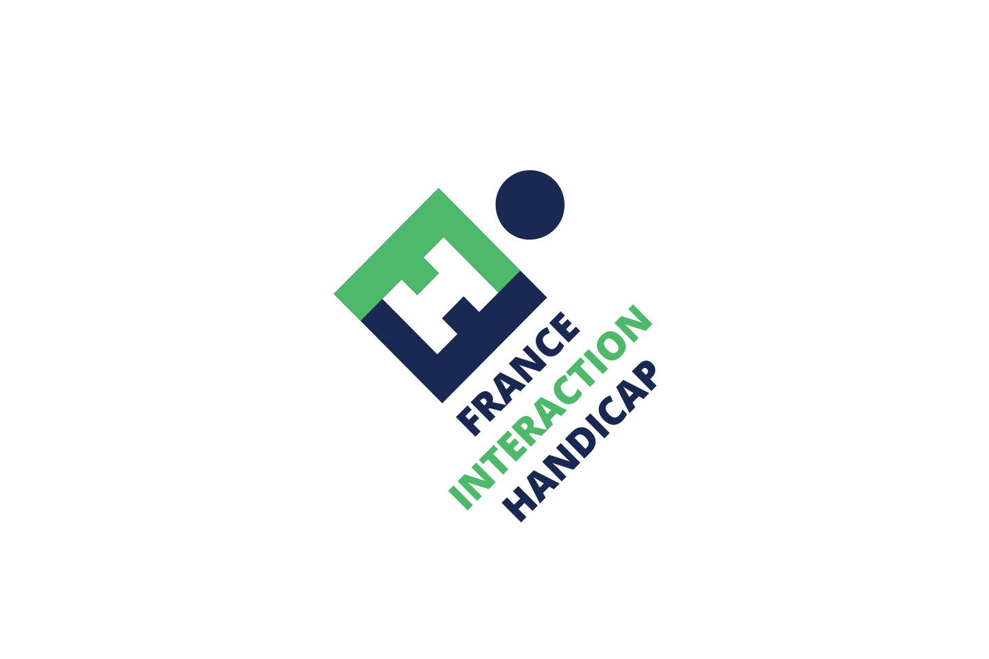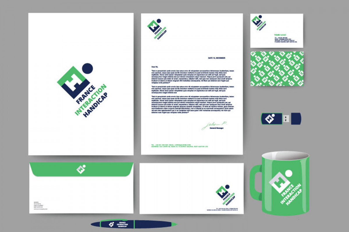
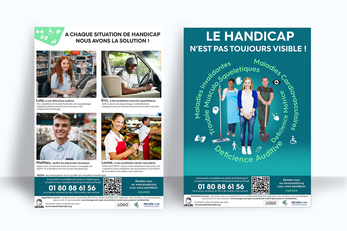
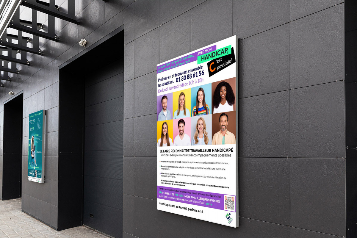
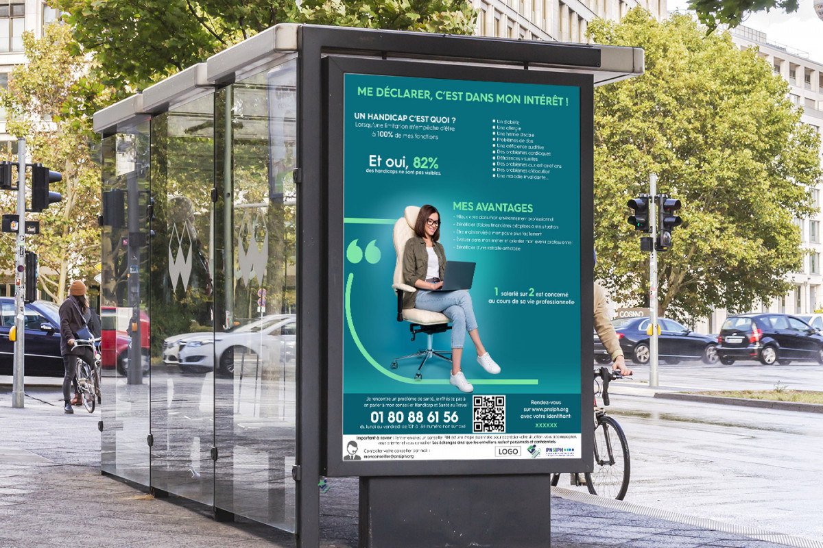
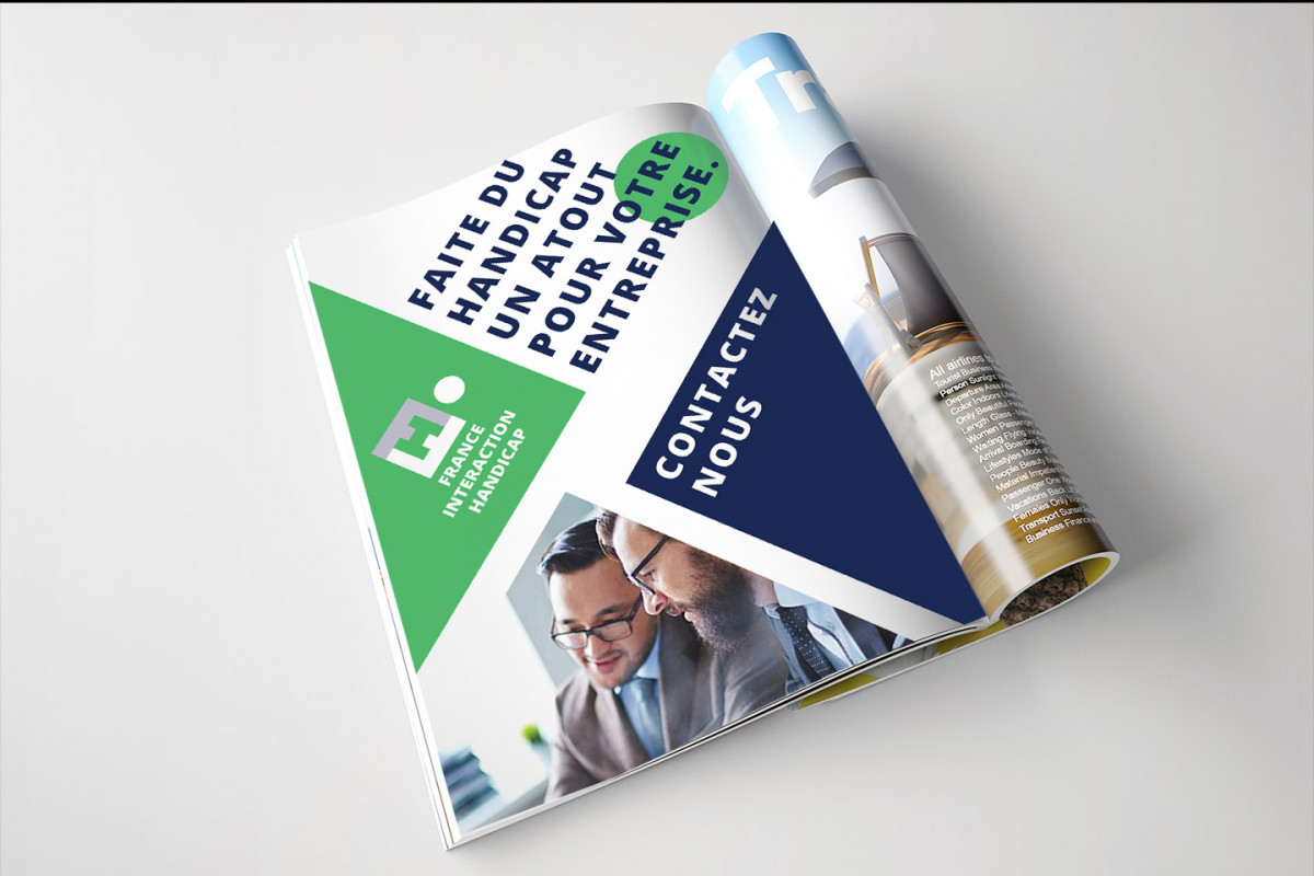
The mission was to Create a brand identity based on a new logo for the FIH ( French Interaction Handicaps) that embodies the vision of combining letters with a hexagonal shape and a sense of progress is a thoughtful approach.
Logo Concept for FIH
1. Design Elements
Hexagonal Shape:
Use of an a hexagon as the base structure to symbolize France (notably the country’s hexagonal shape).
This shape represent unity and community.
Letter Integration:
Combine the letters “F,” “I,” and “H” creatively within the hexagon.
The letters form a cohesive shape, inter wining them to suggest connection and collaboration.
45-Degree Angle:
Tilt the entire logo (both the hexagon and the letters) at a 45-degree angle to convey movement and progress.
This angle create a dynamic look, suggesting forward momentum and innovation.
2. Color Palette
Primary Colors:
Blue: Represents trust and professionalism.
Green: Symbolizes passion and energy.
White: Evokes clarity and accessibility.
Font Choice:
By combining these elements, the FIH logo effectively communicate its mission, embodying progress and a focus on the human element within the framework of accessibility and support.