The mission was to do a rebranding of a logo for a learning platform called “New Learning” involves creating a fresh, modern design that conveys innovation, accessibility, and educational growth.
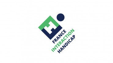
The mission was to Create a brand identity based on a new logo for the FIH ( French Interaction Handicaps) that embodies the vision of combining letters with a hexagonal shape and a sense of progress is a thoughtful approach.
Logo Concept for FIH
1. Design Elements
Hexagonal Shape:
Use of an a hexagon as the base structure to symbolize France (notably the country’s hexagonal shape).
This shape represent unity and community.
Letter Integration:
Combine the letters “F,” “I,” and “H” creatively within the hexagon.
The letters form a cohesive shape, inter wining them to suggest connection and collaboration.
45-Degree Angle:
Tilt the entire logo (both the hexagon and the letters) at a 45-degree angle to convey movement and progress.
This angle create a dynamic look, suggesting forward momentum and innovation.
2. Color Palette
Primary Colors:
Blue: Represents trust and professionalism.
Green: Symbolizes passion and energy.
White: Evokes clarity and accessibility.
Font Choice:
By combining these elements, the FIH logo effectively communicate its mission, embodying progress and a focus on the human element within the framework of accessibility and support.
When l’Hotel Particulier Wagram, from Paris, approached me for the redesign of there visual identity, we understood the importance of capturing their…